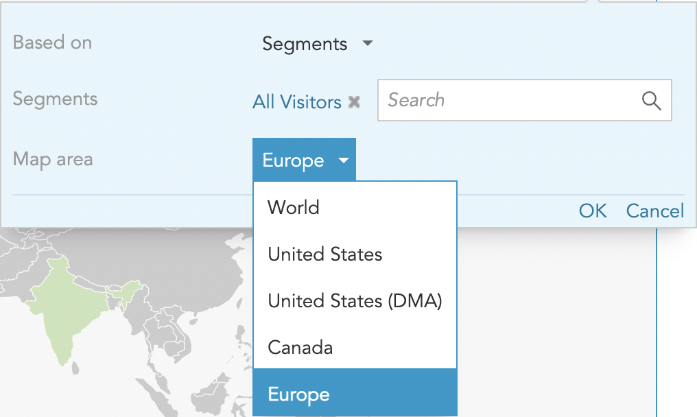
The Location Monitoring Insight visualizes segmentation and profile property data on world, Europe, Canada, or U.S. maps.
Click the settings gear icon in the top right of the widget to configure the visualization.
Select up to 5 segments or profile property values to analyze together.
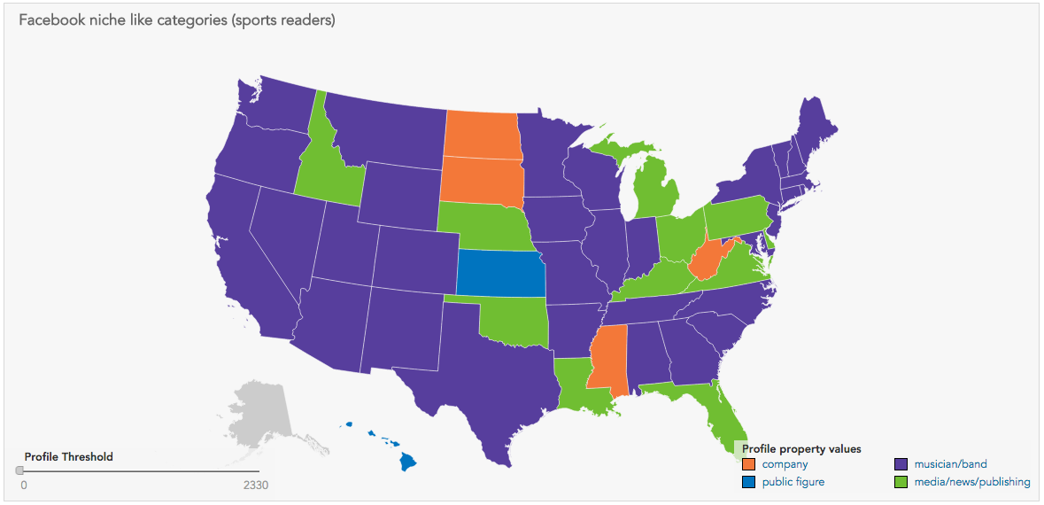
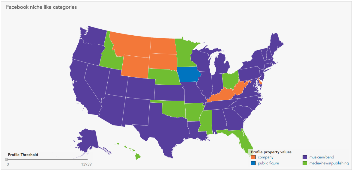
When selecting profile property values, you can also apply a segment to the visualization. For example, the final two images below show all users' top niche Facebook like categories, and the same categories for sports readers only.
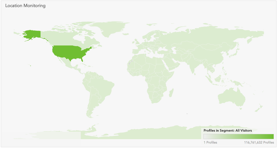
Select a segment to see how customers are distributed geographically.
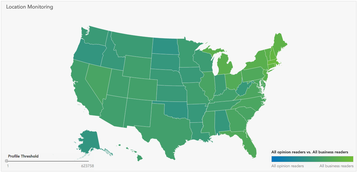
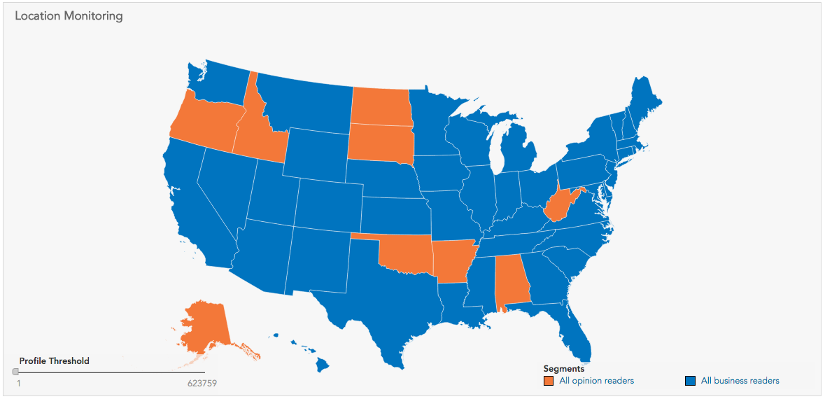
Select two segments, and a two-color gradient will show how unevenly each geographic area is distributed between the two:
Optionally, you can show the segment with the most profiles in each geographic area instead of a gradient:
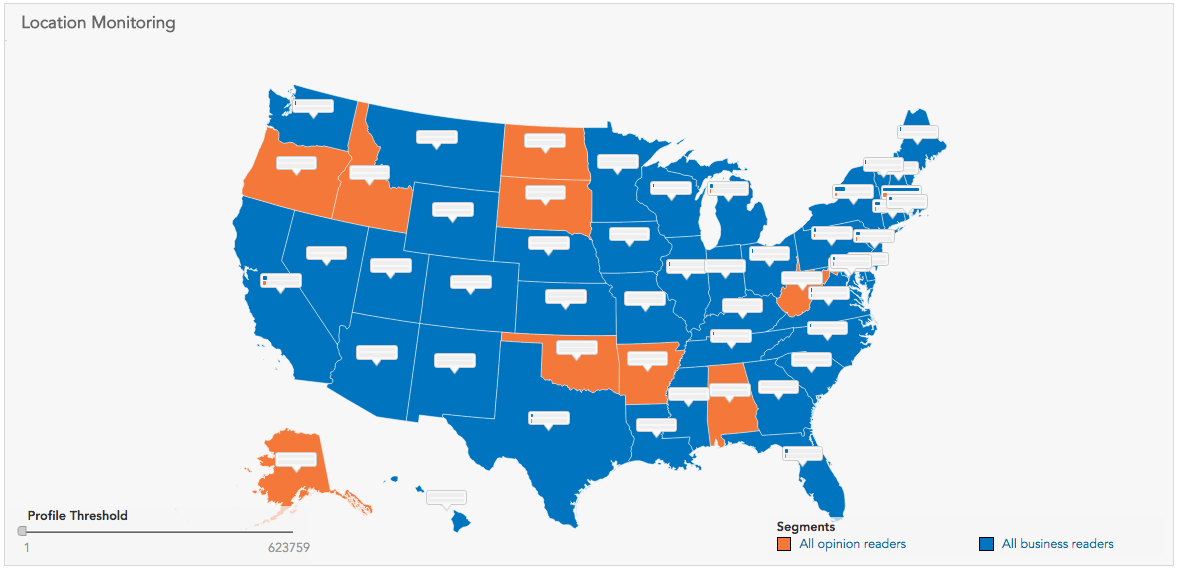
Shown now with the details for each state:
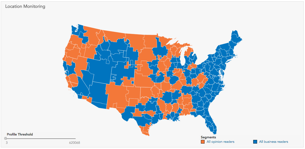
... and shown now with the U.S. DMA map:
Select more segments (up to 5) to show which segments are most prevalent in each geographic area: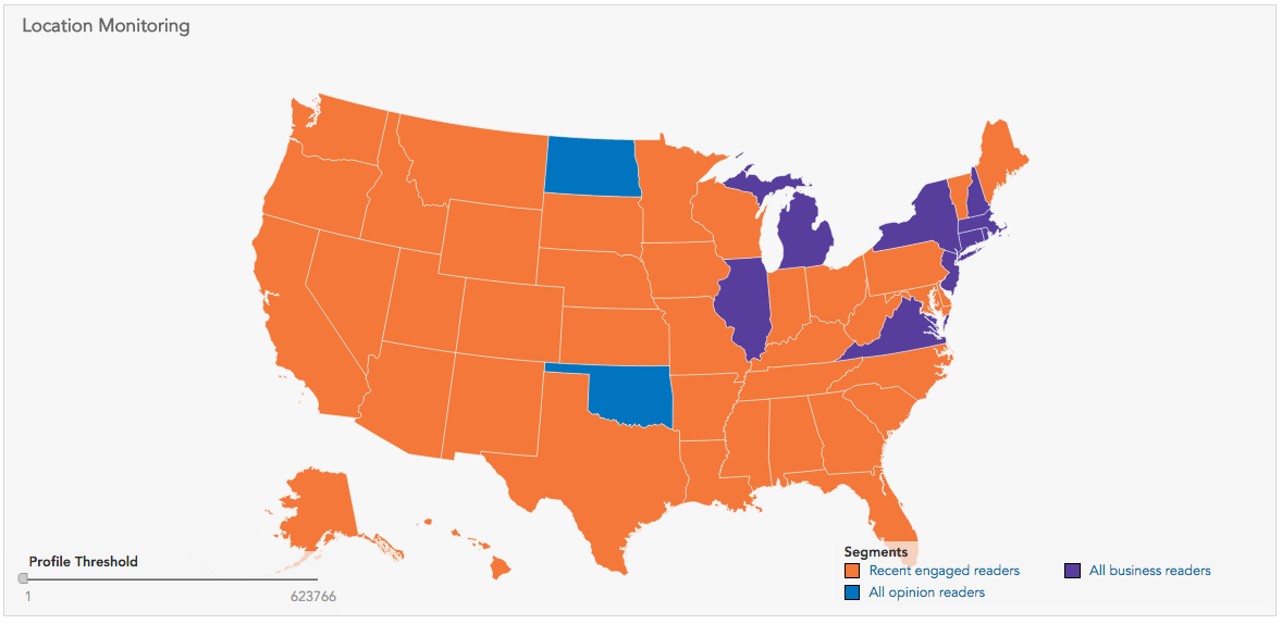
Selecting profile properties instead produces similar visualizations:
With the added bonus of being able to apply segmentation: