
Place the Variants insight in a BlueConic dashboard to show a graph with multiple lines, each representing a variant of the selected Optimizer Dialogue. These variants can be compared on views, clicks, conversions, or one of the three corresponding ratios or lift ratios.
The Variants insight and its controls
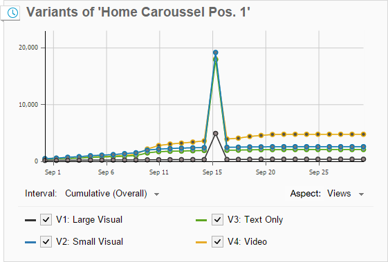
This example shows an Insight based on the "Variants" type:
- X and Y axis
-
- The X axis shows the date.
- What the Y axis shows depends on the option chosen at the Unit.
- Variants
- The variants are shown at the bottom of the insight. You can select up to 6 variants to be shown in the graph. If a dialogue has more than 6 variants, select the variant name to select any of the available variants.
Configuring the Variants insight
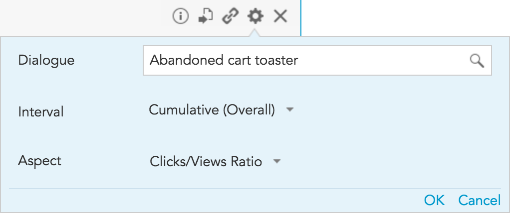
- Dialogue (required)
- Select the dialogue for which you want to see the variants.
- Interval (required)
-
- Daily: The time period will be divided into days. For example, if the time period is "Last month", the graph will be divided into 30 days. The start value for each day is 0.
- Weekly: The time period will be divided into weeks. For example, if the time period is "Last Quarter", the graph will be divided into 12 weeks. The start value for each week is 0.
- Monthly: The time period will be divided into months. For example, if the time period is "Last Year", the graph will be divided into 12 months. The start value for each month is 0.
- Cumulative (period): Shows the cumulative total for the entire selected time period beginning with the first day. The start value for the period is 0.
- Cumulative (overall): Shows the cumulative total for the entire selected time period beginning with the first day. The start value for the period is the cumulative total up to the beginning the selected time period.
- Aspect (required)
- Select the aspect, or marketing metric, that is shown for each variant.
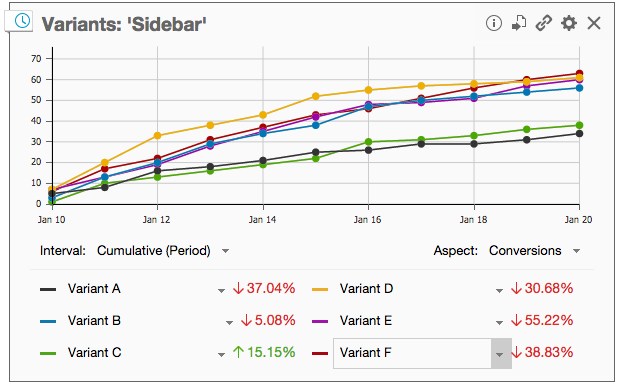
Dashboard time period settings
The insight takes the time period setting of the dashboard into account. This is indicated by the clock icon in the top left. When a time period has been selected for the dashboard the graph changes to display the variant data for the selected time period.
When a time period has been selected for the dashboard and the "Compare with previous" option has been activated, a percentage is shown to indicate the difference between the variant data of the current period compared to the variant data of the previous period.
See also: Variants Table Insight